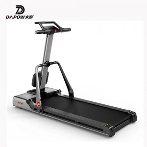
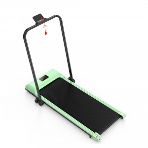
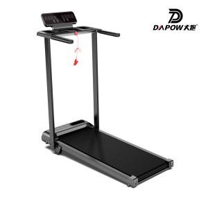
Control Panel for Electric Treadmills: Key Usability Design Principles
Have you ever stood before a feature-rich electric treadmill in a store or showroom, feeling completely overwhelmed? Dense clusters of buttons and convoluted hierarchical menus make starting a brisk walk feel like cracking a code. This isn’t just consumer frustration—it’s a missed sales opportunity for manufacturers and retailers. A poorly designed control panel can single-handedly eliminate a product during the user experience phase.
For B2B buyers, panel usability directly impacts user satisfaction, after-sales costs, and even brand reputation. This article dissects how to design an intuitive, “zero-thinking” panel from a practitioner’s perspective. You’ll master core design principles—from layout and interaction to feedback—empowering your product to stand out in fierce competition through exceptional user experience.
01 Physical Layout of Control Panels: Achieving “Within Arm’s Reach”
Physical layout forms the user’s first tactile impression. An intuitive layout requires no manual consultation. The core principle is clear zoning with distinct primary and secondary areas.
Critical functional zones should be physically separated. Core controls like speed, incline, and start/stop must be centralized and prominent, with larger buttons for frequently used functions. Advanced settings (e.g., program selection, user profiles) can be grouped into separate zones. This zoning helps users rapidly build a mental map.
Materials and craftsmanship are critical. Button tactility must be distinct. I tested a product where the “Speed+” button featured a slightly raised silicone material with a clear tactile feedback, preventing accidental presses even during blind operation while running. Conversely, membrane buttons with ambiguous tactile feedback easily cause misoperations and may even pose safety risks.
A noteworthy example comes from the American brand NordicTrack. On their commercial series, the large red “Emergency Stop” magnetic button is physically isolated in the lower left corner of the panel, separated from all function keys. Its color and placement create a strong safety cue. This design significantly reduces accidental activation rates in gym environments.
Common User Question: Which is better—physical buttons or touchscreens?
Expert Answer: It depends on the product’s positioning. For commercial and high-intensity home use, physical buttons (especially backlit ones) offer greater reliability and remain operable even when sweaty. Large touchscreens suit immersive home interactions, supporting richer visual content, but come with higher costs and require anti-misoperation algorithms. Mid-range products can adopt a hybrid design: “physical core buttons + touchscreen auxiliary display.”
02 Interface Logic & Interaction Flow: Achieving “Three-Step Accessibility”
Beyond physical layout lies software interaction logic. Complexity is usability’s worst enemy. Our goal: any common function must be accessible within three steps.
Menu structures must be flat. Avoid deep, nested menus. Place frequently used speed and incline adjustments in the top-level menu or directly on the home screen. Emulate smartphone design principles: position “Start Exercise” as the most frequent action, designing it as the largest, most prominent virtual button for instant access.
Information architecture must align with users’ mental models. Users aren’t engineers—they think “I want to walk briskly for 30 minutes,” not “set a 6 km/h program.” Preset programs should be named for goals like “Fat Burn,” “Cardio,” or “Hill Climb,” not impersonal codes like “P01.”
Interaction feedback must be immediate and unambiguous. Every action should receive clear visual or auditory confirmation. For example, when adjusting speed, the numerical change should feature a smooth animation accompanied by a short “beep.” If the response is sluggish, users may doubt whether their action succeeded, leading to repeated clicks and system confusion.
A positive example is the product logic of the Peloton Tread. It keeps the real-time data most important to users (speed, incline, heart rate, distance) permanently fixed at the top of the screen. Below is the live class interface. All controls are executed via a single large knob: rotate to adjust speed/incline, press to confirm. This “one-knob flow” design enables safe, precise device control even during high-speed running, with minimal learning curve.
Common user question: Doesn’t more functionality equate to higher-end? Why simplify?
Expert answer: “More” features and “better” features are distinct concepts. Feature overload only increases choice overload and potential failure points. True “premium feel” stems from an exceptional core experience and “invisible intelligence.” For example, the panel recommends the most suitable program at startup based on historical user data—this is sophisticated “subtraction.” Remember, users buy a health tool, not an airplane cockpit.

03 Visual Design & Information Presentation: How to Make Data “Instantly Clear”?
During exercise, users glance at the panel for mere seconds. The goal of visual design is: instant comprehension.
The primary principle is clear information hierarchy. Core dynamic data (like current speed and time) must be displayed in the largest, highest-contrast font. Secondary data (like total distance and calories) can be appropriately scaled down. Color usage should be restrained and meaningful—for example, green for the safe zone and orange for upper limit alerts.
Visibility must be guaranteed in both bright and low-light conditions. This requires sufficient screen brightness and contrast, along with automatic light adjustment. I once reviewed a product whose screen suffered severe glare in direct sunlight, rendering data completely unreadable—a critical design flaw.
Icon design must be universally recognizable. Avoid obscure custom icons. Symbols like “play/pause” and “up/down” should use globally understood symbols. For complex functions, combining icons with brief text labels is the most reliable approach.
Data-backed insight: A survey of home fitness equipment users revealed that over 40% cited clear, easy-to-read real-time speed displays as one of the most critical factors influencing continued use—even surpassing motor quietness.
Common user questions: Is bigger always better for screens? How high should the resolution be?
Expert Answer: Screen size should match viewing distance and product dimensions. For treadmills, where users typically glance down or maintain eye level, 10-12 inches suffices. The critical factors are pixel density (PPI) and response speed. High PPI ensures sharp text, while high response speed guarantees smooth scrolling and animations without ghosting. A large screen with severe lag delivers a far worse experience than a responsive smaller screen.
04 Safety and Fault-Tolerant Design: How to Prevent “Accidental Slips”?
Safety is the baseline of usability. All design must prioritize safety above all else.
Emergency stop functionality must be the highest priority. Whether physical buttons or on-screen virtual buttons, they must be accessible from any interface and state, triggering instantly with a single press. The system must never introduce delays or confirmation pop-ups—this is the golden rule.
Critical parameter settings require error-proofing mechanisms. For instance, when transitioning directly from high speed to low speed or stop, the system can introduce a brief buffer phase or display a concise confirmation prompt (e.g., “Confirm switching to 3 km/h?”). This prevents abrupt jerks caused by accidental touches, protecting users’ joints.
Permission management is especially critical for B2B clients. In gyms or hotels, administrator mode should lock speed limits and prohibit program modifications to prevent untrained guests from performing dangerous operations. Simultaneously, providing a child lock function is a key consideration for home users.
Fault tolerance also manifests in system self-recovery. Robust design anticipates system crashes. For instance, incorporate a hidden hardware reset hole or automatically cut motor power and restart the interface after prolonged unresponsiveness. This significantly reduces after-sales repair rates.
An insight from commercial maintenance data: Among reported gym equipment failures, approximately 15% of software-related service calls stem from users repeatedly forcefully manipulating buttons or screens due to interface lag, resulting in hardware damage. A smooth, clearly responsive panel design inherently reduces the likelihood of such human-induced damage.
The control panel of an electric treadmill serves as the core hub connecting users to the product. Its value extends far beyond merely controlling the motor. A truly well-designed, user-friendly panel lowers the learning curve, enhances workout enjoyment, ensures safety, and ultimately amplifies the product’s reputation. For B2B buyers, it means fewer customer service inquiries, lower return rates, and higher customer loyalty. Remember: the best design is one where users don’t even notice it exists—everything feels natural.
Frequently Asked Questions (FAQ)
Q1: How do you balance the need for simplicity for older users and the desire for tech features among younger users when designing the panel?
A1: Implement a “layered design” or “family account” strategy. The default interface should be a minimalist “Quick Start” mode displaying only core functions like speed, incline, and start/stop buttons to meet the needs of older users. Upon logging into their personal accounts, users can unlock full course access, data analytics, and social features catering to younger users. This approach satisfies the needs of multiple generations with a single machine.
Q2: How should panel durability and waterproof ratings be evaluated, especially for gym environments?
A2: Commercial settings require high durability ratings. The front panel must meet at least IP54 dust and water resistance to withstand sweat and cleaning agents. Buttons should pass million-press durability tests. The frame must be sturdy enough to withstand impacts. Request suppliers to provide reliability test reports during procurement, not just feature claims.
Q3: What are future control panel design trends? Should we integrate voice or gesture control early?
A3: Voice and gesture serve as complements, not replacements. Voice recognition remains unreliable in noisy home or public gym environments, making it suitable only for simple commands like “start” or “stop.” Gesture control is prone to false triggers. The current pragmatic trend prioritizes deep integration with mobile apps, moving complex settings to smartphones while keeping the panel itself minimalist. Simultaneously, leveraging sensors for adaptive adjustments (e.g., automatically fine-tuning speed based on heart rate) represents a more advanced direction for “usability.”
Meta Description:
How to design truly user-friendly control panels for electric treadmills? This article delves into four core elements—physical layout, interaction logic, visual presentation, and safety design—to help manufacturers and buyers create a “zero-thinking” user experience, reduce after-sales costs, and enhance product competitiveness. Get the professional design guide now.
Keywords:
Electric treadmill control panel, treadmill panel usability design, fitness equipment human-computer interaction, commercial treadmill interface, control panel layout principles
Post time: Dec-31-2025


